Helium SEO: Logo Redesign
_Branding _Logo Design

Project Objectives
01.
Create a simplistic logo that gives the viewer an immediate and clear sense of the company that is clean and uncluttered.
02.
Increase the versatility by making a logo that can be used on different platforms and in various formats and sizes.
03.
Build a logo that delivers an immediate and honest impression to the viewer about the essence of the company.

The Goal
CEO Tim Warren and the Helium SEO team helped us understand the dream for the new logo. Create something:
- Futuristic like our technology
- Approachable like our team
- Distinct from our competition
- Confident in our expertise
Additionally, the Helium SEO logo redesign needed to be able to be used in circumstance when only one or two colors can be used.
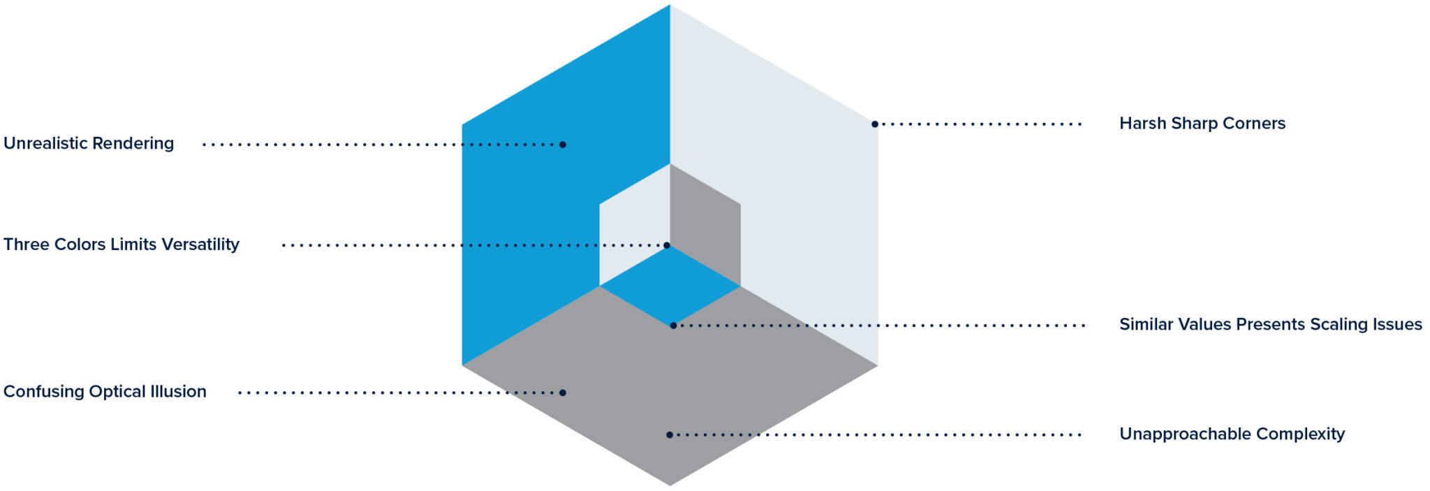
The Analysis
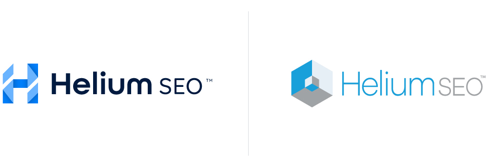
Before a new logo could be create, an analysis of the shortcomings of the previous logo was done. These issues were presented to Tim in order to solidify a direction and approach for the new branding.
The Process
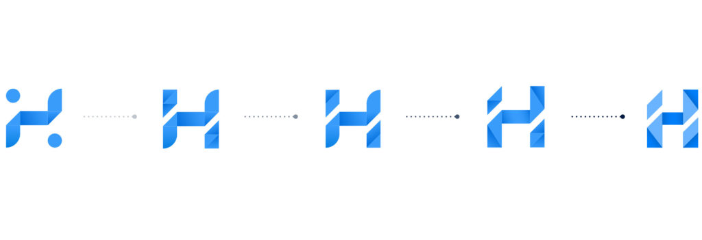
Helium SEO is a data-drive digital marketing agency rooted in engineering. In addition to the increased application versatility, the logo personifies their technological expertise, approachability, and trustworthiness. Pieces of the whole that allowed this story to come to life are as follows:
- Angled Counter Spaces: The counter-spaces in “H” trend upwards to indicate the increasing visibility they bring the their clients brands.
- Geometric Color Blocks: The color blocks make it more dimensionality and gives a subtle sense of complexity and through simplicity.
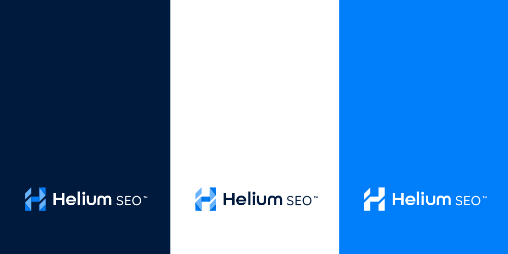
The Color
The existing Helium SEO color palette was in need of an update. We wanted to select a color palette that reflected the desired characteristics for the new design (Futuristic, Approachable, Distinct, Confident). The following colors were selected with those objectives in mind:
- Azure Blue: Ambitious, Purposeful, Trustworthy
- Oxford Blue: Quality, Knowledgeable, Respected
- White: Secure, Professional, Intellegent
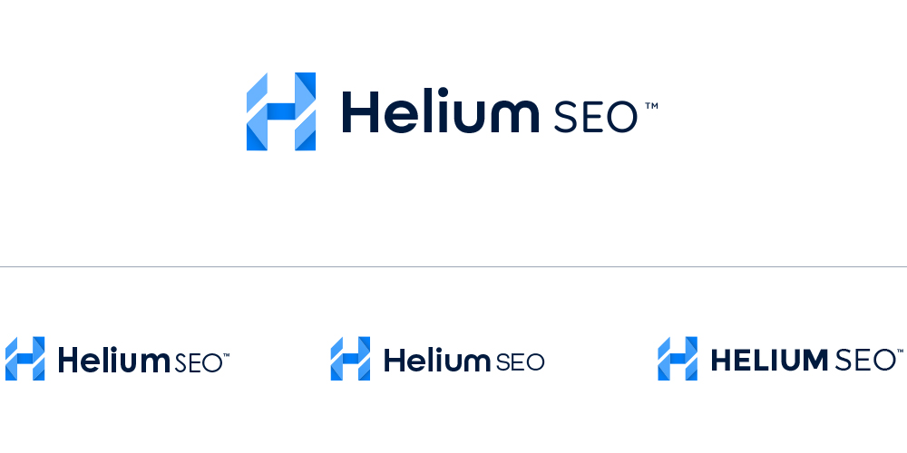
The Font
An exploration of fonts took place in order to determine what typeface and case would pair best with the “H” icon. All Round Gothic was chosen for the text because of it’s soft and friendly letterforms. This selection helped balance the boldness and sharpness of the icon itself.
